Website:
Randalpro

Randalpro is a secondary business of Randal S.A that is tailored to the professional trade.
This website acts as online version of their catalogue that is renewed every three to four years. The entire product range a long with all the imagery and finishes can be viewed online.

Some of the improvements/additions to the website were the following

  • Update catalogue PDF
  • Improve functionality of website
  • Create landing page for their modular builder
  • Change various images to newer versions

crea Landing page

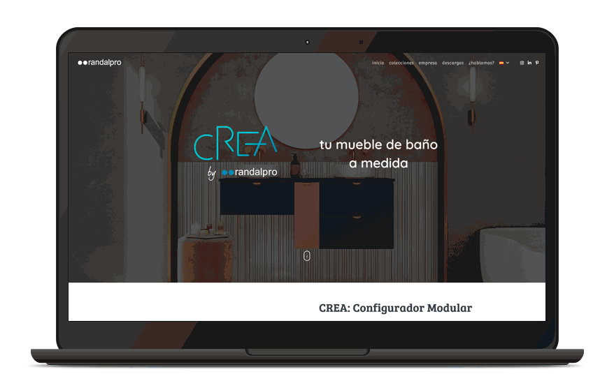
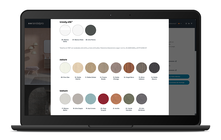
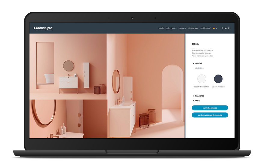
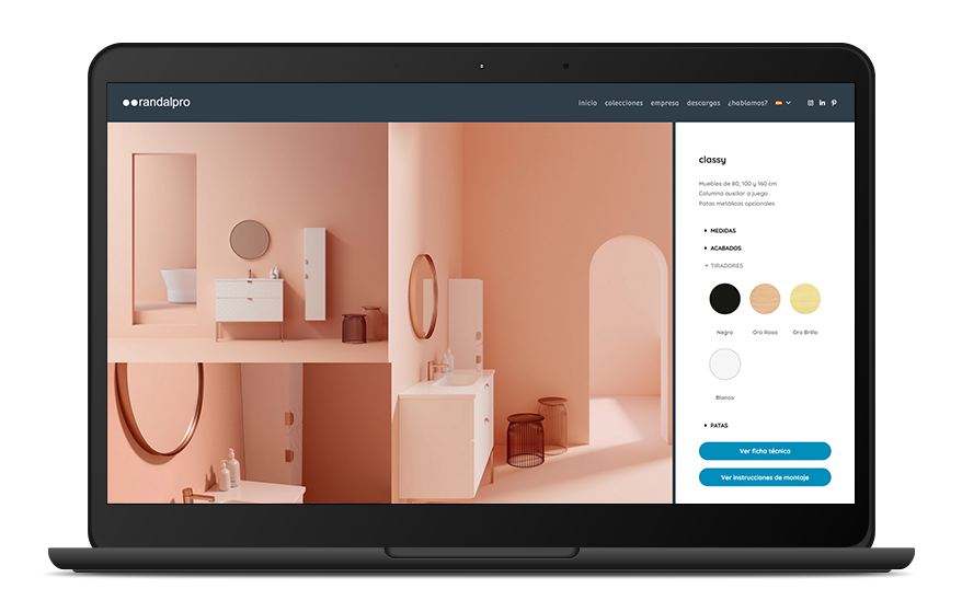
As mentioned previously one of the tasks for the website was to create a landing page that would be a spotlight for their online bathroom furniture builder. Known as Crea this site allows users to choose from several finishes, handles, mirrors, sinks and vanity units to create custom bathroom designs.

The purpose of the landing page was to give visitors a better idea of the capabilities and options available in Crea and how it can benefit their customers.

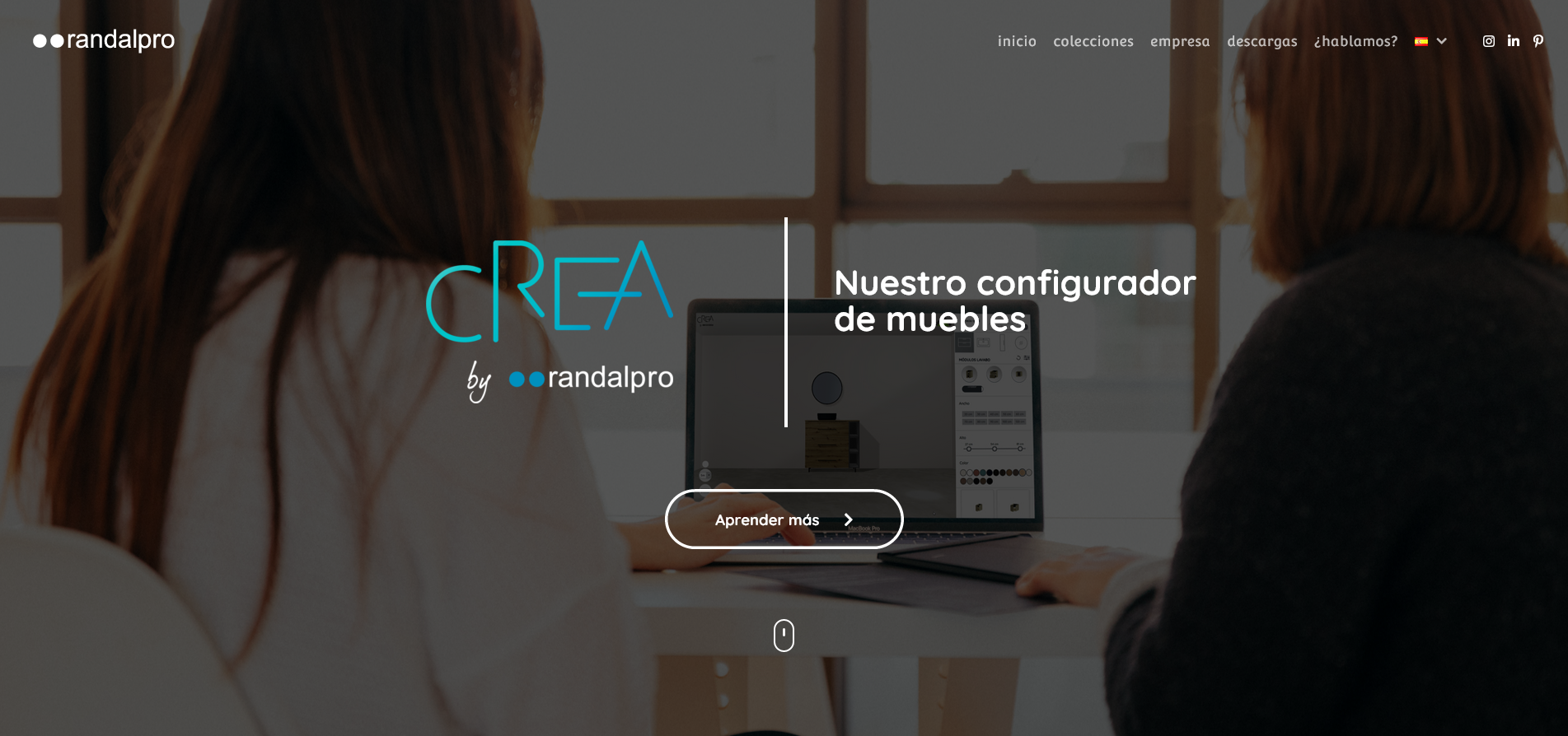
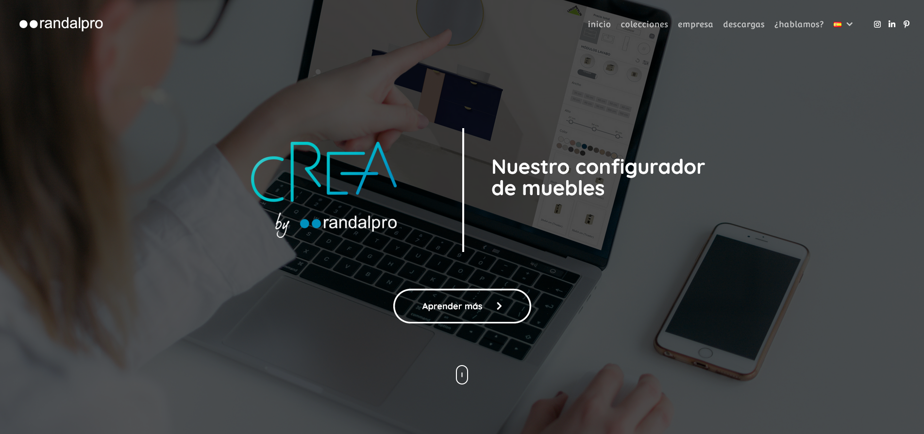
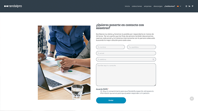
On the landing page I created an animated gif showing a typical process of designing a custom bathroom on the site. Also, a contact form for visitors to get in touch with the team to create an account.

At the bottom of the page, I included a gallery with designs created by stores around the country and creations made by the team at Randal.

crea banners

Once this page was to be completed, we needed to create a focal point on the front page that would lead users to the Crea landing page. For each of the banners I edited the stock images to show people using the Crea website in various scenarios.

Banner 1

Banner 2

Banner 3

Website Fixes

I was assigned this project as there were quite a few areas of attention that needed to be completed. A few of the changes and improvements can be found in the images below, in addition I made the following changes to the website:

  • Fixed broken language links, activating the toggle often took users to error 404 pages.
  • Optimised images for web, many of the previously uploaded images had a high resolution and file size.
  • Added consistency to fonts, colours, and buttons
  • Removed issue that made images in banner of low quality
  • Colour graded images of models to match catalogue
When the user began to scroll down to sections where the background was white the nav would disappear completely as the text was also white. I fixed this issue by adding a blue background colour once the user begins to scroll down.

The previous contact from was not consistent with the style of the rest of the website, it was using the default styles of the plugin. I styled this form and matched the styles with the contact form on the Crea landing page.  

Finishes tab

The finishes needed some urgent attention, most of the finishes for each of the models were incorrect. Also, they were all displayed inline vertically and created some scrolling issues once the tabs were opened.

As many of the models shared the same finishes, I created a page with all the finishes and made this a pop-up for the models it applied to. For the collections that had their own unique finishes I created a three-column template that could be inserted into the tabs of each of these models.

Version 1 0

All tabs closed

Tabs open to reveal pop-out link

Pop-out appears with all the finishes available

Finishes continued

Vanity unit finishes
Handles and feet both use the same finishes