Website:
Raquel Caballero

Raquel Caballero is a dietician with a focus on nutrition education from infancy to adolescence and continuing through to adulthood. The initial website had several problems such as poor image quality, no clear message of Raquel´s services or credentials.  

Some of the improvements/additions to the website were the following

  • Create suitable banners that conveys a clearer message
  • Improve imagery of entire website
  • Add navigation to website
  • Remove unnecessary text and sections

One page design

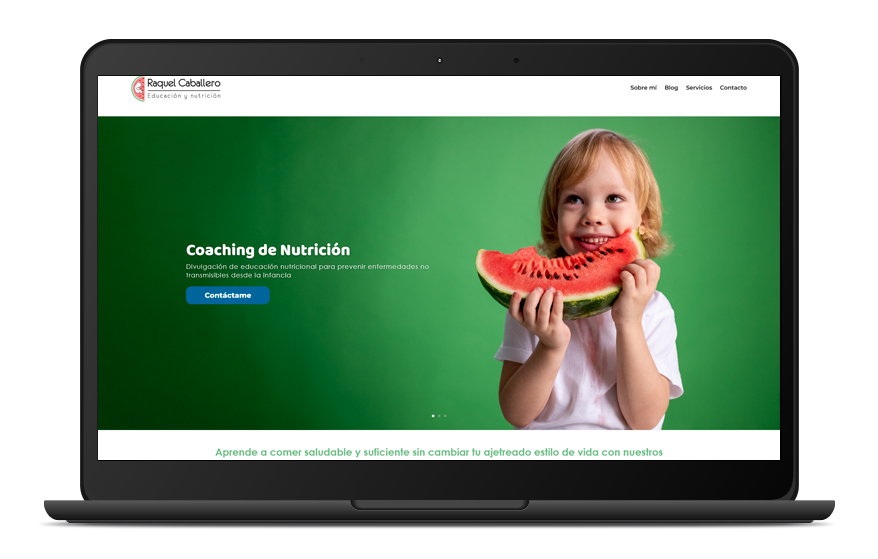
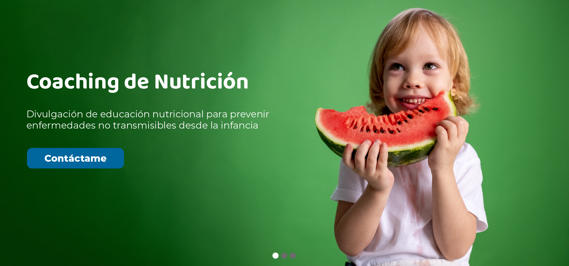
After my initial meeting with Raquel, I made notes regarding some of the issues that I saw with the website and how it related to her objectives. I went through the entire page taking screenshots of problematic areas which I then presented in a PDF with notes.

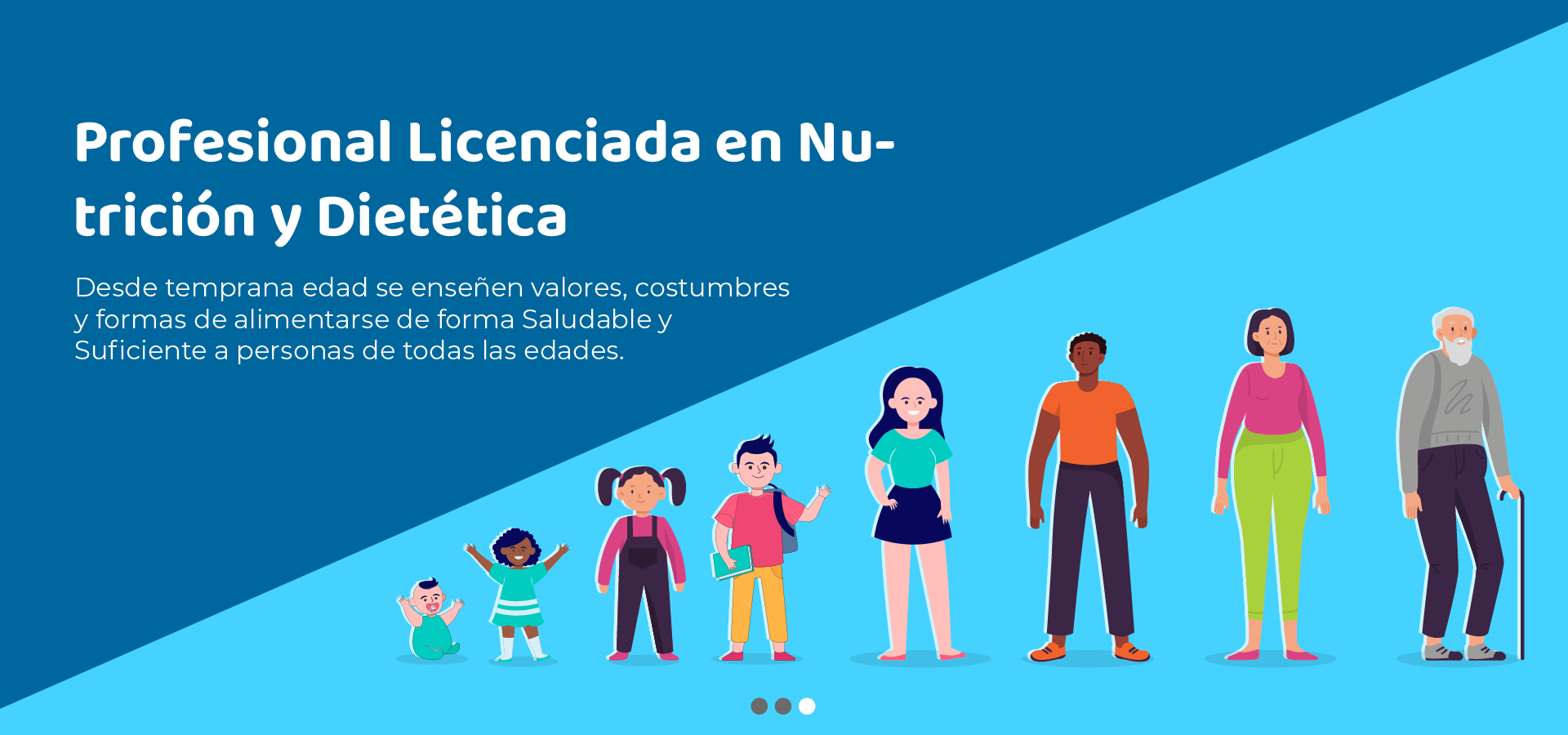
One of my main goals was to make it clear to visitors that this is a service dedicated to nutrition education with an emphasis on children and schools. I didn’t immediately get that from first visiting the website so needed to come up with solutions to better convey this message.

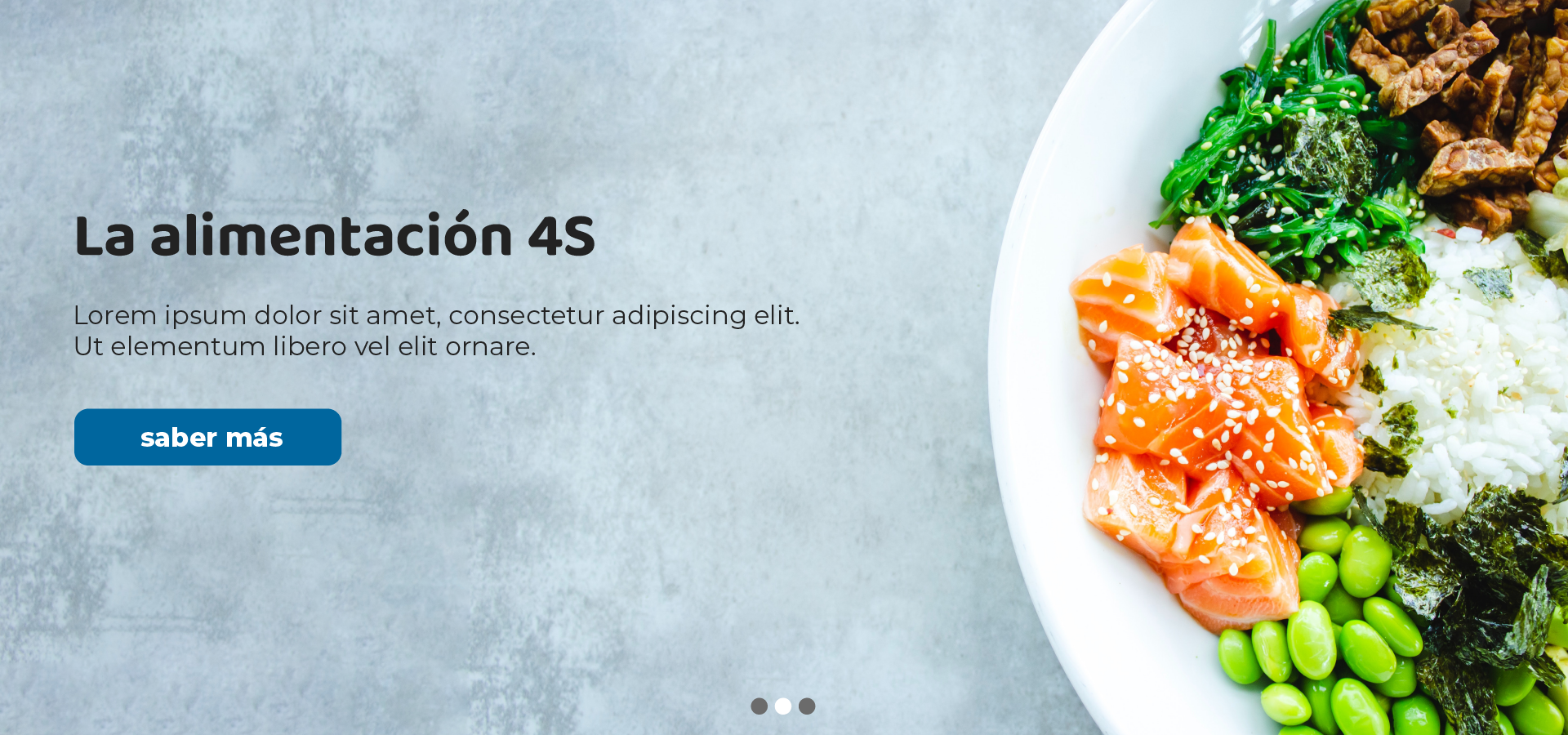
Also, there were issues with text formatting, there was little to no distinction or hierarchy between texts. Light text against light backgrounds and no consistency with font families.

Home banners

The original website had only one banner which featured some healthy food. However, this didn’t give users enough information about what the site is about or Raquel´s services. Also, as this was geared towards children and families, I wanted to create a more youthful style for the website. The first step was to create some engaging banners.  

Banner 1
Features child eating healthy food, also a contact button for user engagement

Banner 2
Background image featuring all the components for a healthy dish. Button links to the 4s section

Banner 3
Background image showing all the stages in life that a person goes through. 

Design Fixes

Raquel needed someone to help her with some changes to the website and manage the site along with the blog. A few of the changes and improvements can be found in the images below

raquel_top_oldraquel_top_new

Changed the formatting of the fonts and layout of this section. Also, the icons didn’t match very well with the subject matter, so I sourced new ones and made them stand out more.

raquel_4s_oldraquel_4s_new

This section needed a complete overhaul. Raquel was not happy with the icons as she felt they didn’t give the user enough information about what each “S” represents. My solution for this section as to split each “S” into a panel and use an appropriate image.   

raquel_courses_oldraquel_courses_new

Another section that needed more attention as I felt there was little effort put into the design of each of the panels. One of my goals of the website was not to overwhelm the user with a lot of text in the beginning so I created a carousel which would contain each of the courses and the information displayed more clearly.

raquel_contact_oldraquel_contact_new

To make the contact form look a bit more interesting I removed the white panel background along with the unrelated image. Keeping in mind the theme of the website I wanted an image that was a bit more youthful and more modern.